Magpie
Banking App
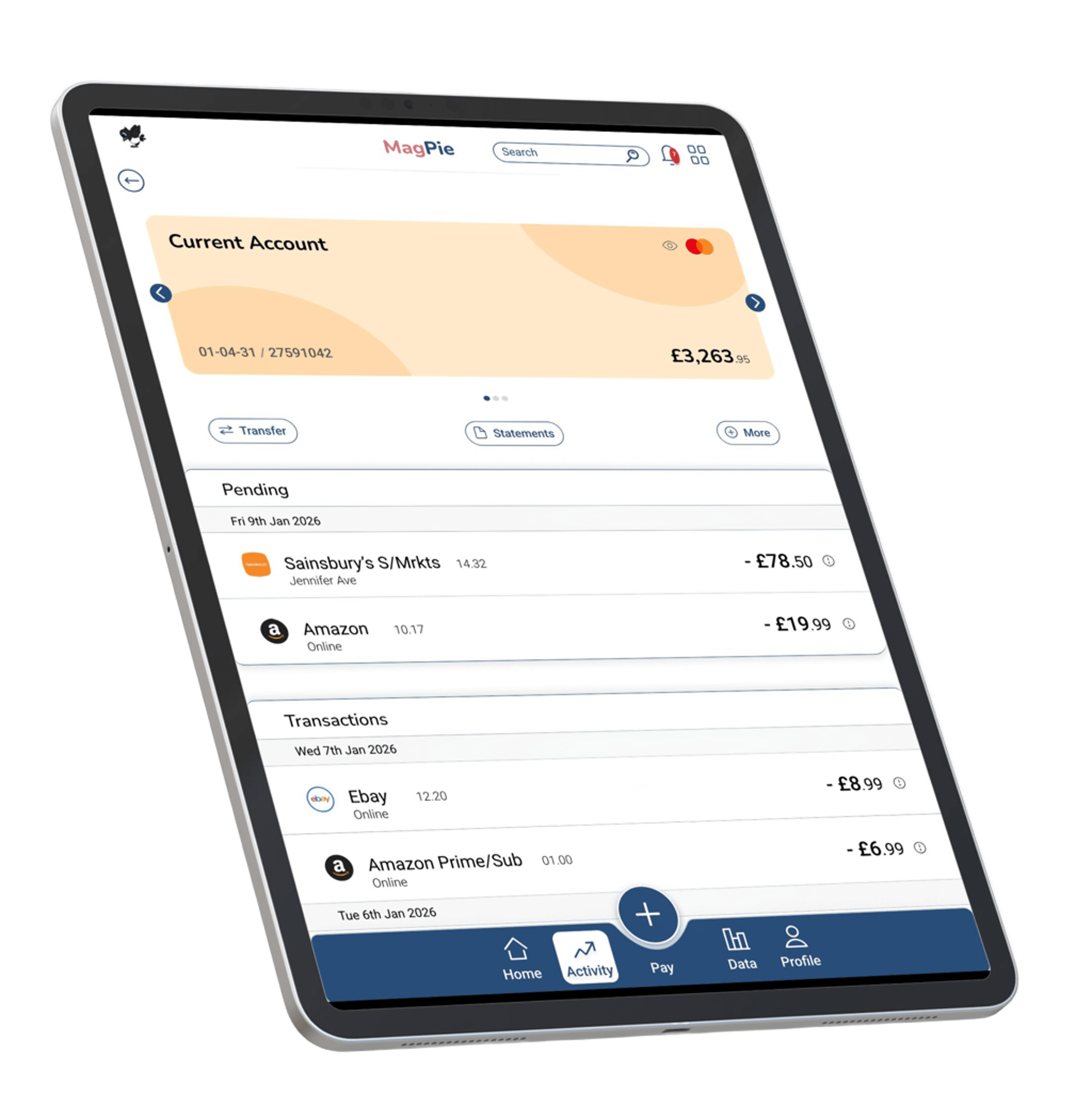
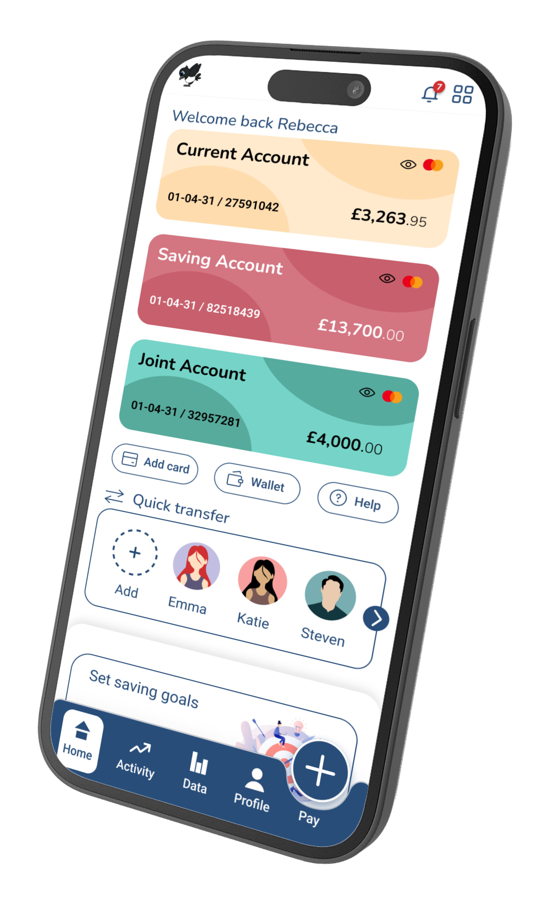
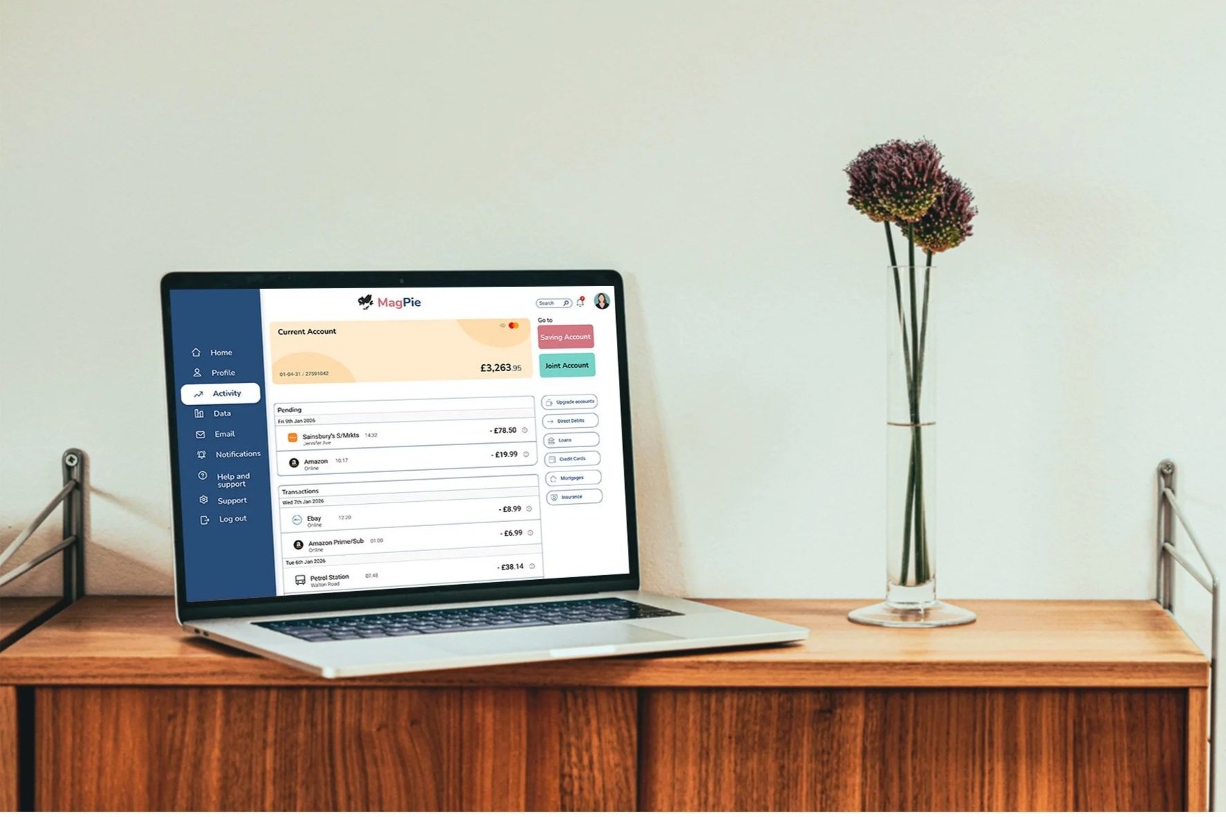
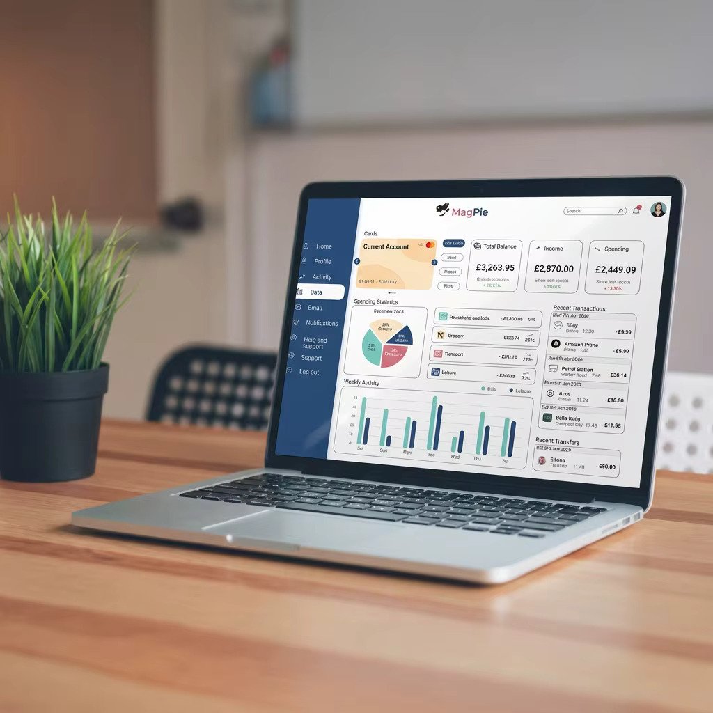
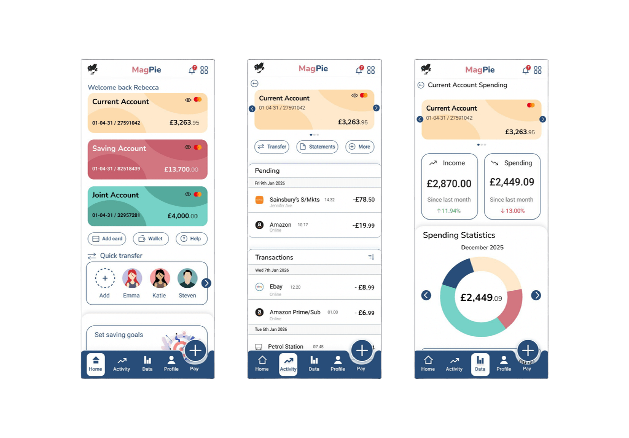
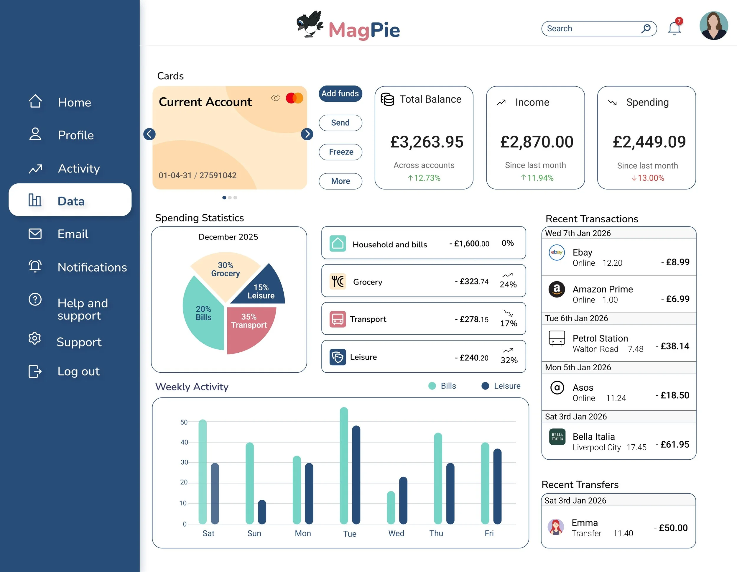
Tasked with designing a mobile banking app that embodied the qualities of trustworthiness, clear and playfulness. The project began with research into brands that shared these traits to gather inspiration. I then carried out research on design elements such as colour, typography and icons. Several screen iterations were created, progressing from wireframes to the final design. The completed screens included the home page, current account, and spending page for mobile, tablet and desktop.
Aug 2025-Jan 2026
Moodboard
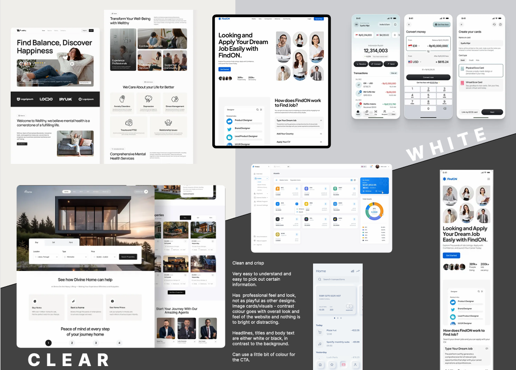
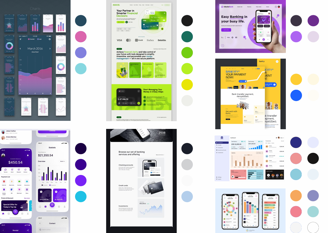
To start, I gathered a collection of websites and apps and created three mood boards. I took inspiration from banking sites as well as other brands that possess the qualities of clear, trustworthy and playful. I included examples across all three design platforms to see how different platforms and screen sizes affect hierarchy and layout of the page.
On the clear mood board, most examples feature black text against a white background for strong contrast. Playful brands attract users with vibrant colours and fun illustrations, while the colour blue often conveys a sense of trustworthiness.
Research and Development
Design elements like iconography, colour and typography make a brand and the banking app complete. I studied these elements to see how competitors use them and how I could get inspiration while also adapt to my own design.
As UI components make up app’s system, extensive research was carried out on all types of components to understand how they are implemented in practice.
Typography and colour are important elements in design as it affects the accessibility of the product. I used colour wheel and experimented with text scale to adhere to the accessibility rules.
Design Iterations
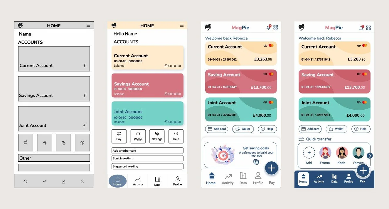
UI design is an iterative process. The project started with wireframes to the final design, each iteration showing the progression of the design of the project. Showing this documentation gives a visual explanation for the design decisions made. As things progressed, more details were added to create a smooth, polished user friendly app.
Colour was a big aspect of the design as the application needed to be playful and draw the user in. The colours of the design altered as it progressed to fit with this quality.
The main task on a banking app is paying or sending money, so a pay button was placed at the bottom right of the screen to make it easy to reach. This CTA could allow the user to complete their task quicker.
Final Design
After a set of iterations were completed, they were reviewed to receive feedback which guided the alterations needed to adhere to accessibility and the brief. As the design was for mobile, tablet and desktop, all screens had to have consistency but showcase the adaptiveness to each platform.
After all decisions and thinking, the final design of all 9 screens were created.