Hotel Now
UX Case Study
While studying at the UX Design Institute, I designed a new hotel booking system. I researched user opinions on current hotel websites, which helped me identify what works well and what could be improved.
Sometimes users struggle to complete their tasks on a booking site because the process is unclear or lacks enough information. The hotel booking site I designed aimed to keep users engaged and guide them smoothly to completing their bookings.
I used Figma for the entirety of this project.
Jul 2024-Jul 2025

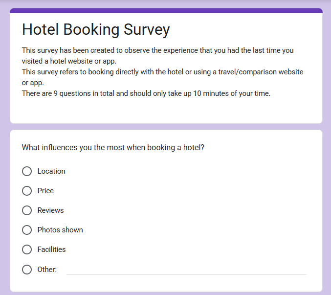
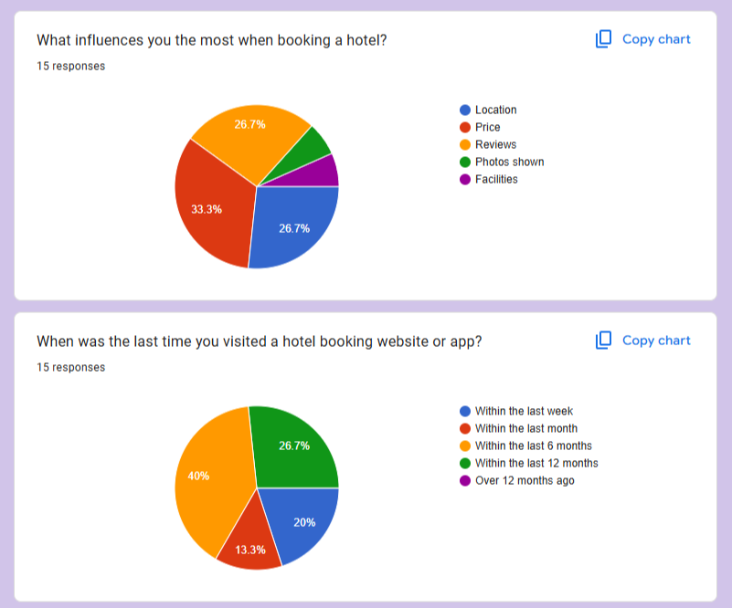
I used Google Forms to create a survey asking users about their most recent visit to a hotel booking site. The responses gave me insight into the positives and negatives of their experience and whether they were able to complete their task on that visit.
A third of users said price was the biggest factor when booking a hotel, while a quarter said that both price and reviews influenced them the most. The hotel site I designed needed to highlight all of this information to maximize user satisfaction.
The insights gathered from this survey inspired my design decisions later on as they would reflect what the user actually wants from the site.
Online Survey
I watched two hotel desktop usability tests and took notes on goals, behaviours, context, positive interactions, and pain points. I made sure my notes were concise yet insightful. From this, I realized the importance of clear, eye-catching imagery and plenty of reviews, as these strongly influenced users. I also observed whether the website guided users through the experience or if they navigated it their own way. In both cases, users started by using the search bar immediately, which inspired me to make this feature stand out on my own site.
Note Taking
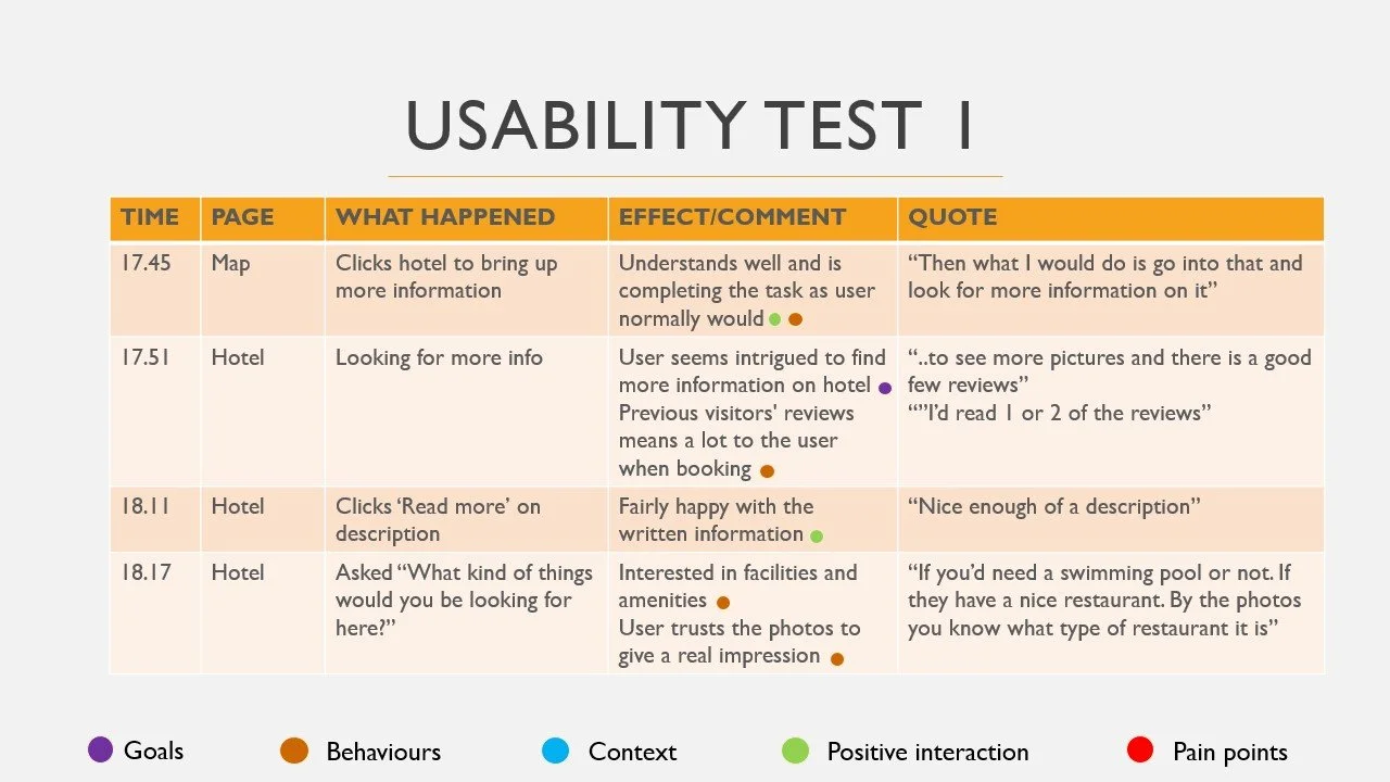
After taking notes on usability tests, I conducted one of my own. This gave me hands-on experience in creating a script and watching a user interact in real time. Booking.com and Airbnb were chosen to navigate through as they were found to be the most popular hotel booking sites from the survey.
On Booking.com, the task was to book a week in Rome City Centre with breakfast included and payment upon arrival. The goal on Airbnb was to find a place near Hyde Park in London for a weekend stay the following May.
The user struggled on the search page of Booking.com as they were unaware the places they were clicking on were opening in a new tab. This confusion took up a lot of time as they thought they had to keep going back and restarting their search. The user also thought the map on Airbnb was too large and did not need to take up that much space on the page on desktop.
Usability Testing
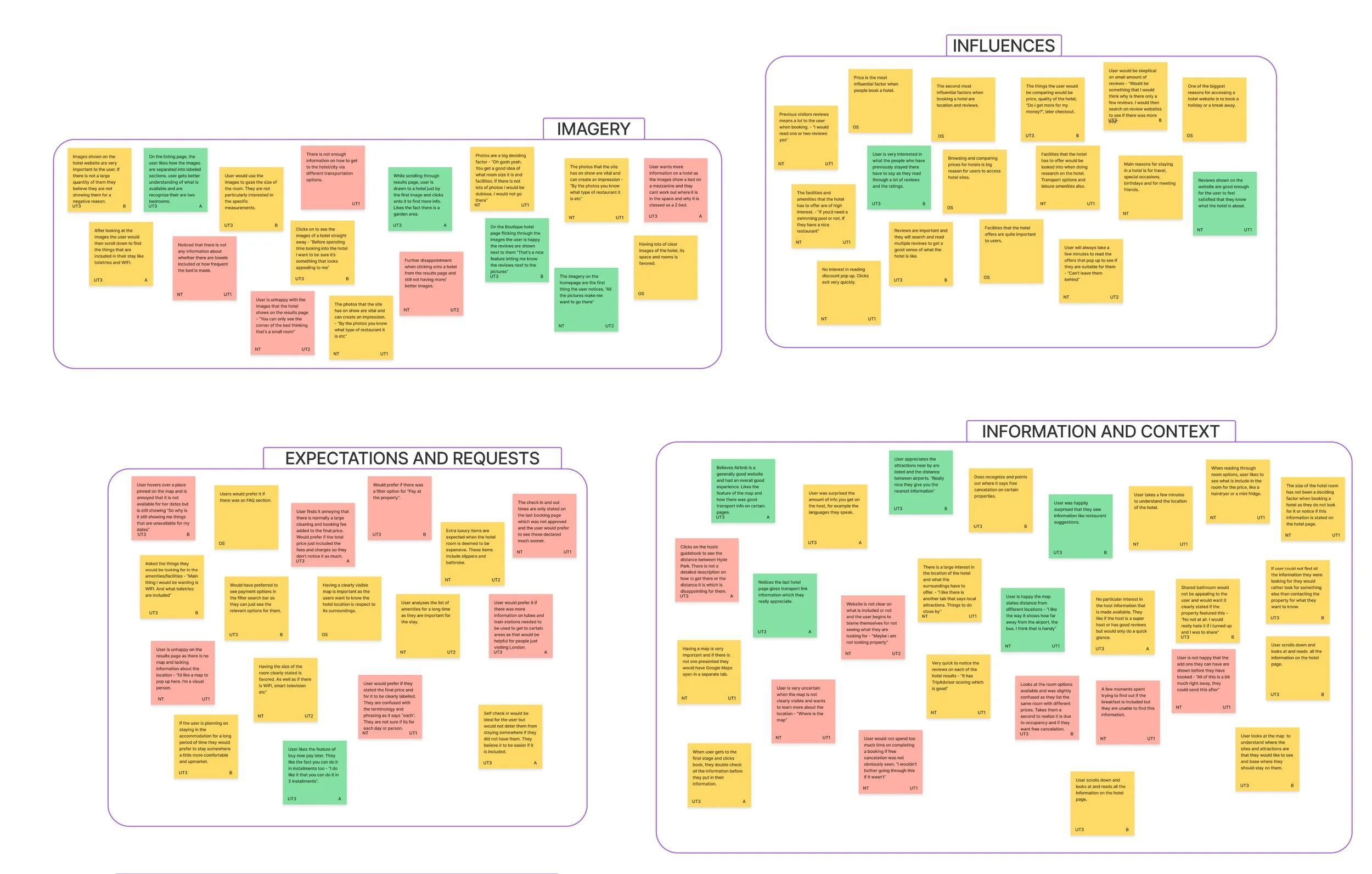
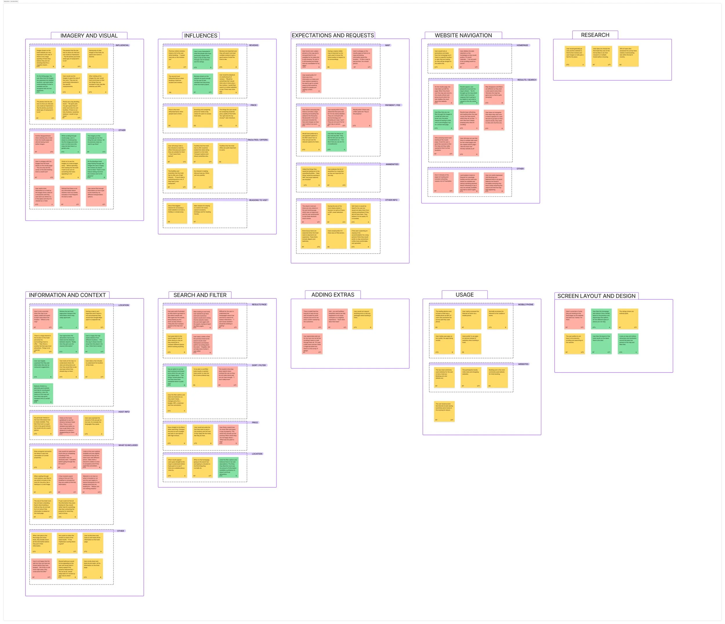
The affinity diagram was the start of my analysis from the research I had conducted. I gathered observations from all my previous work and created a document that contained notes that were neutral, positive or negative. I then organised these notes into groups and further sub groups. The groups consisted of imagery/visual, influences, navigation, search and filter and more.
This task allowed me deconstruct the vast amount of data I had collected and spot any patterns.
Affinity Diagram
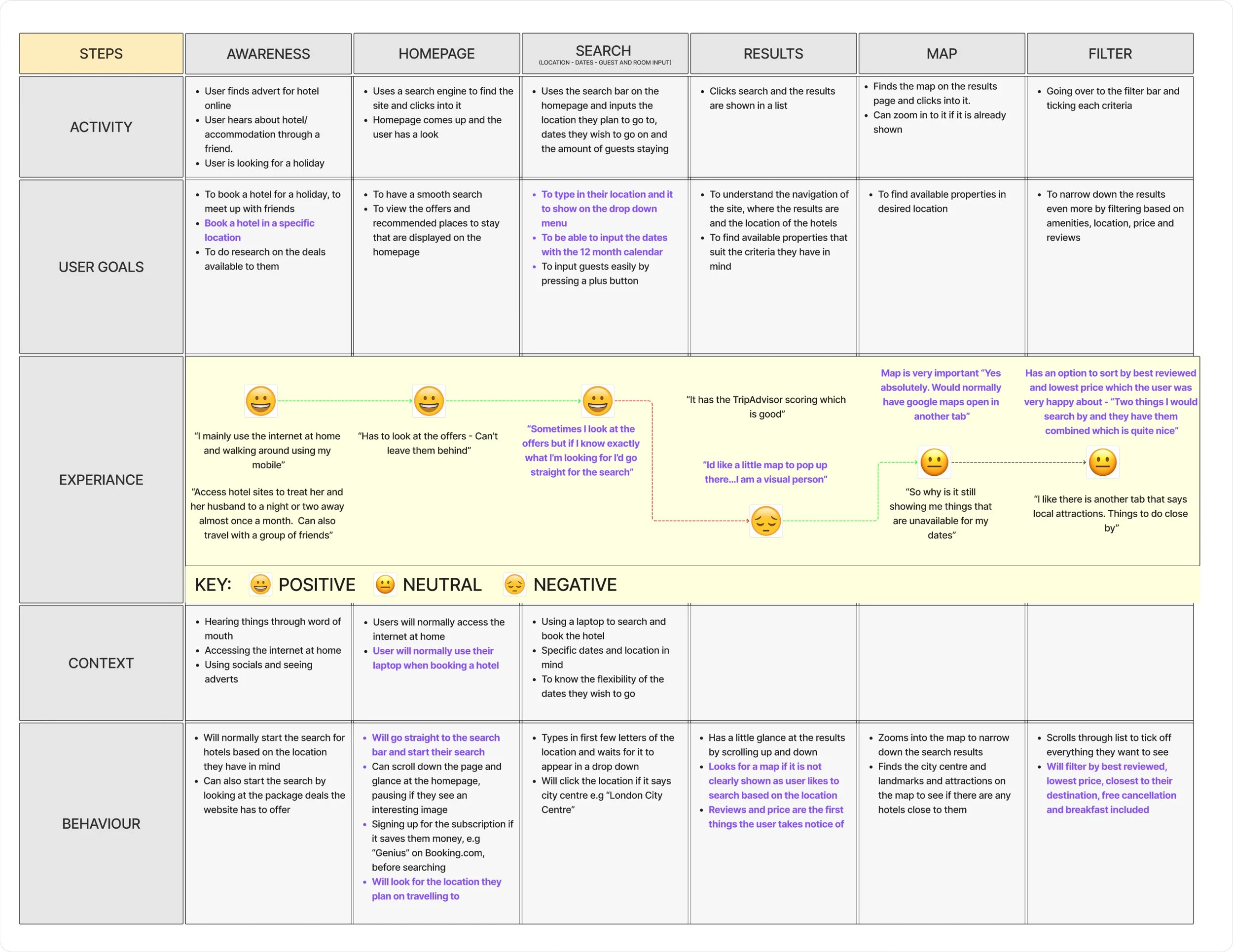
After finding the patterns in my research, I could now imagine how the average user would go from the homepage to the booking page of a hotel booking site. I then created a customer journey map to visualise this journey, making clear observations on the effect that each step has on the user. I was able to use this map to find the opportunities I could take with my project to improve the user experience.
Customer Journey Map
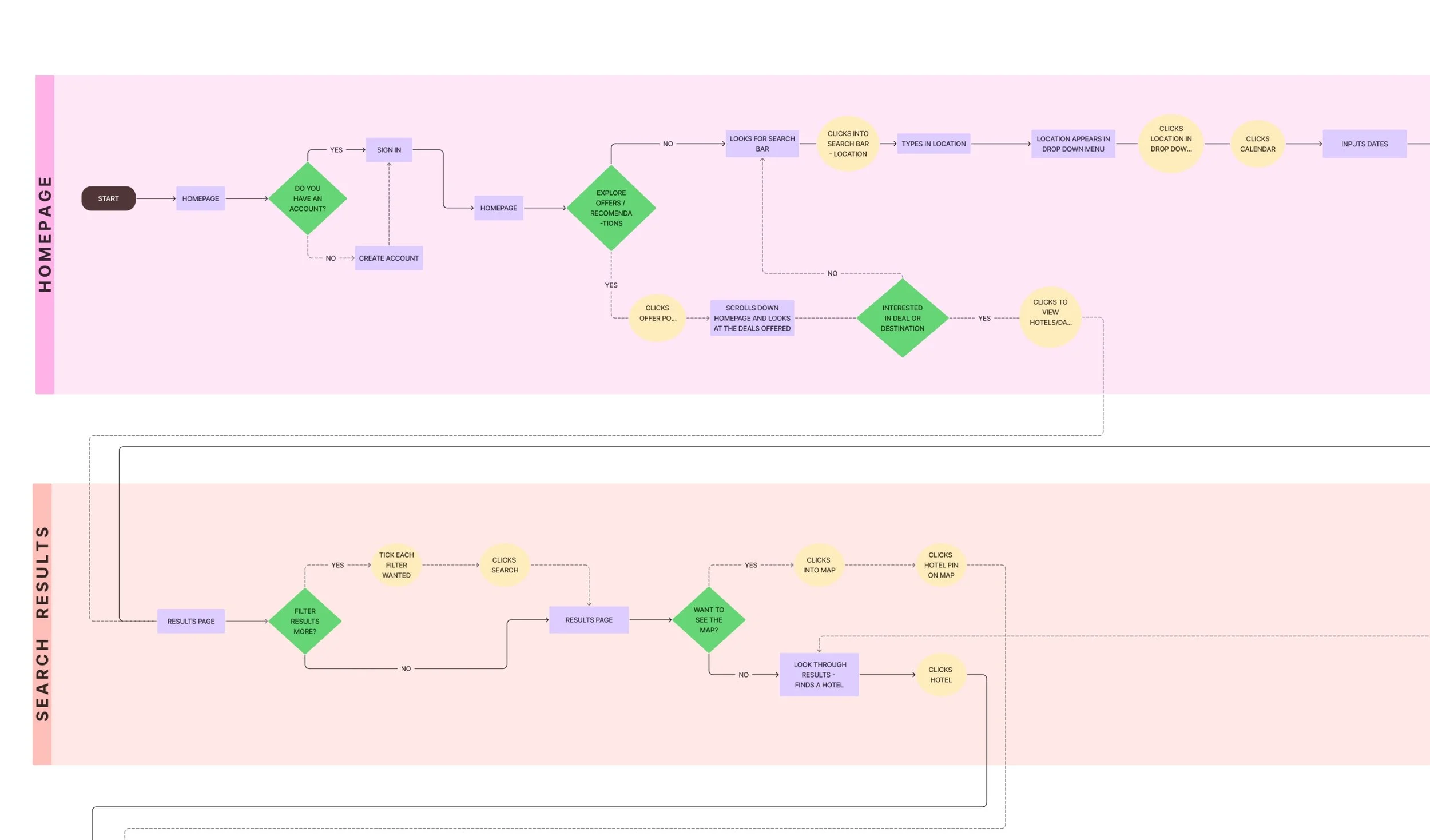
To start the design stage, I created a flow diagram to define each step the user could take on their booking journey. It shows where a process, decision or an action will be taking place and what the user could do in that moment.
This diagram allowed me to create the optimum flow for the user, as well as making me understand how the site cam help the user get back into the optimum path.
This diagram will be reflected on throughout the design stage, guiding me on how the actions users take, changes screens.
Flow Diagram
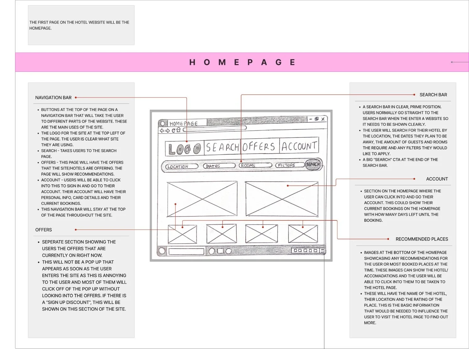
Before starting my prototype, I created sketches of what the site was going to look like. This was an iterative process as I had ideas and thoughts after every sketch. I used the knowledge I now had through my research by following design conventions and patterns that users liked.
I then annotated these wireframes, describing what each CTA would do, actions users could take and describing the sections that were lacking in detail at this stage.
Wireframes
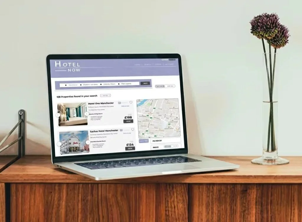
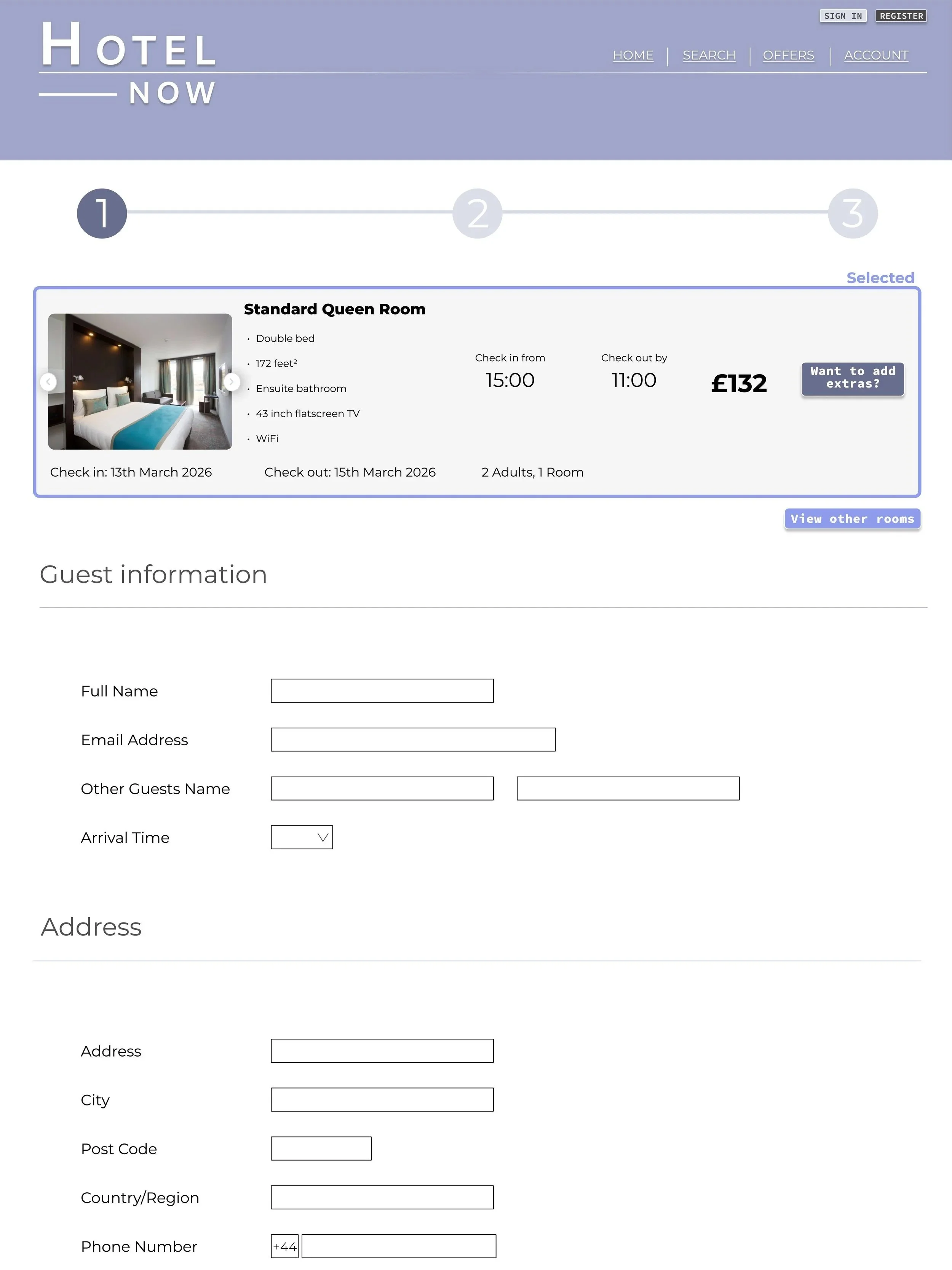
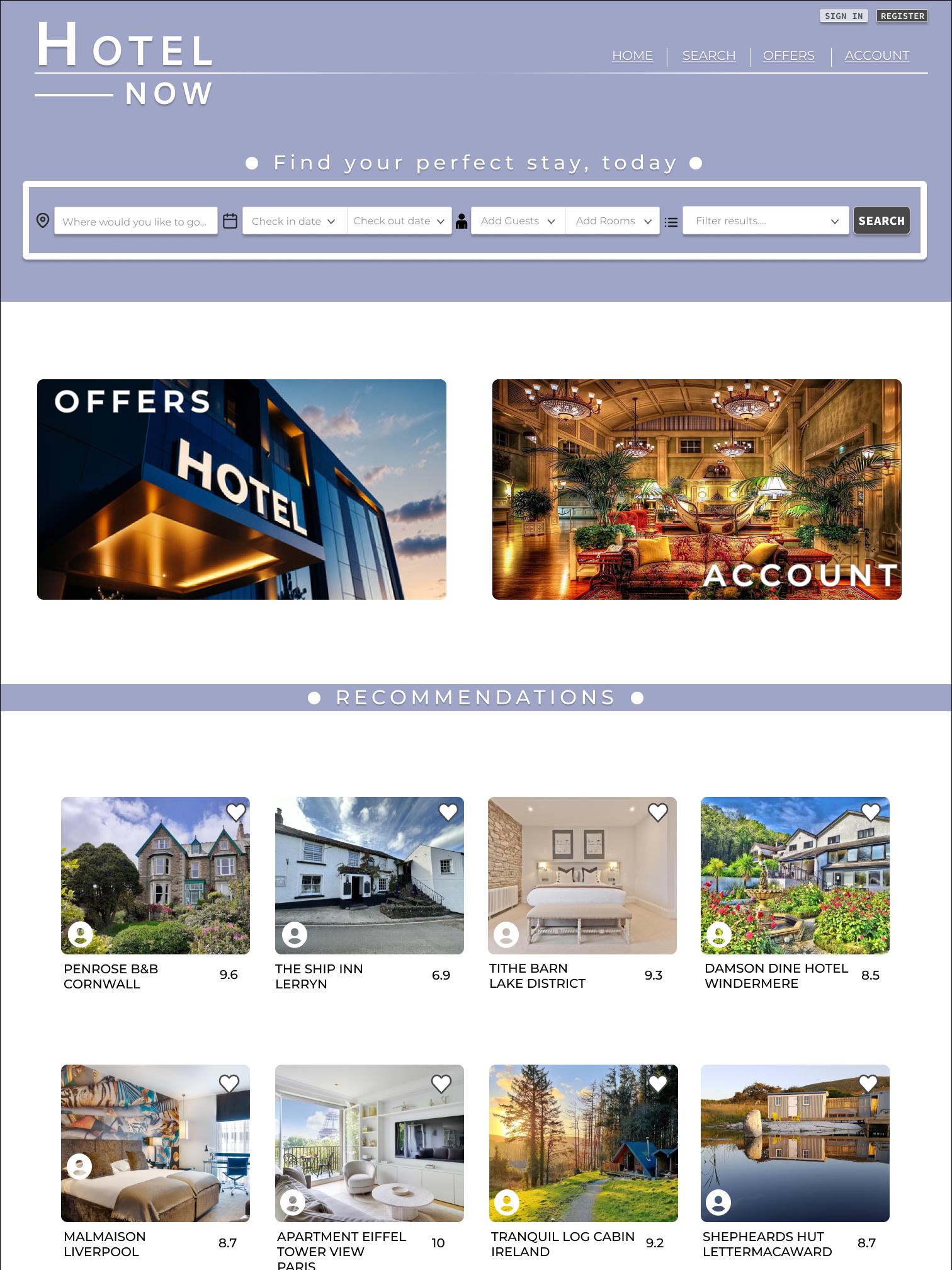
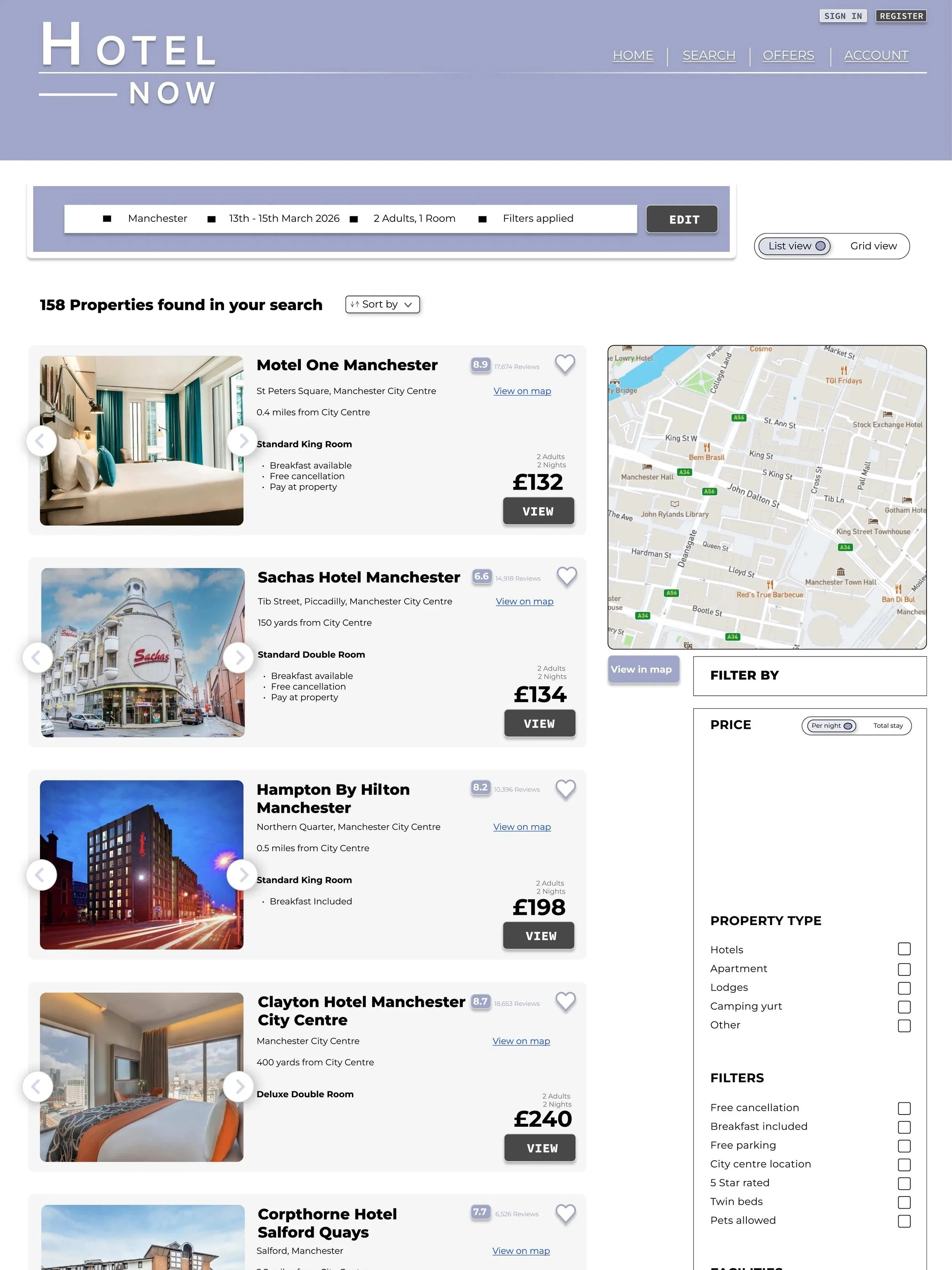
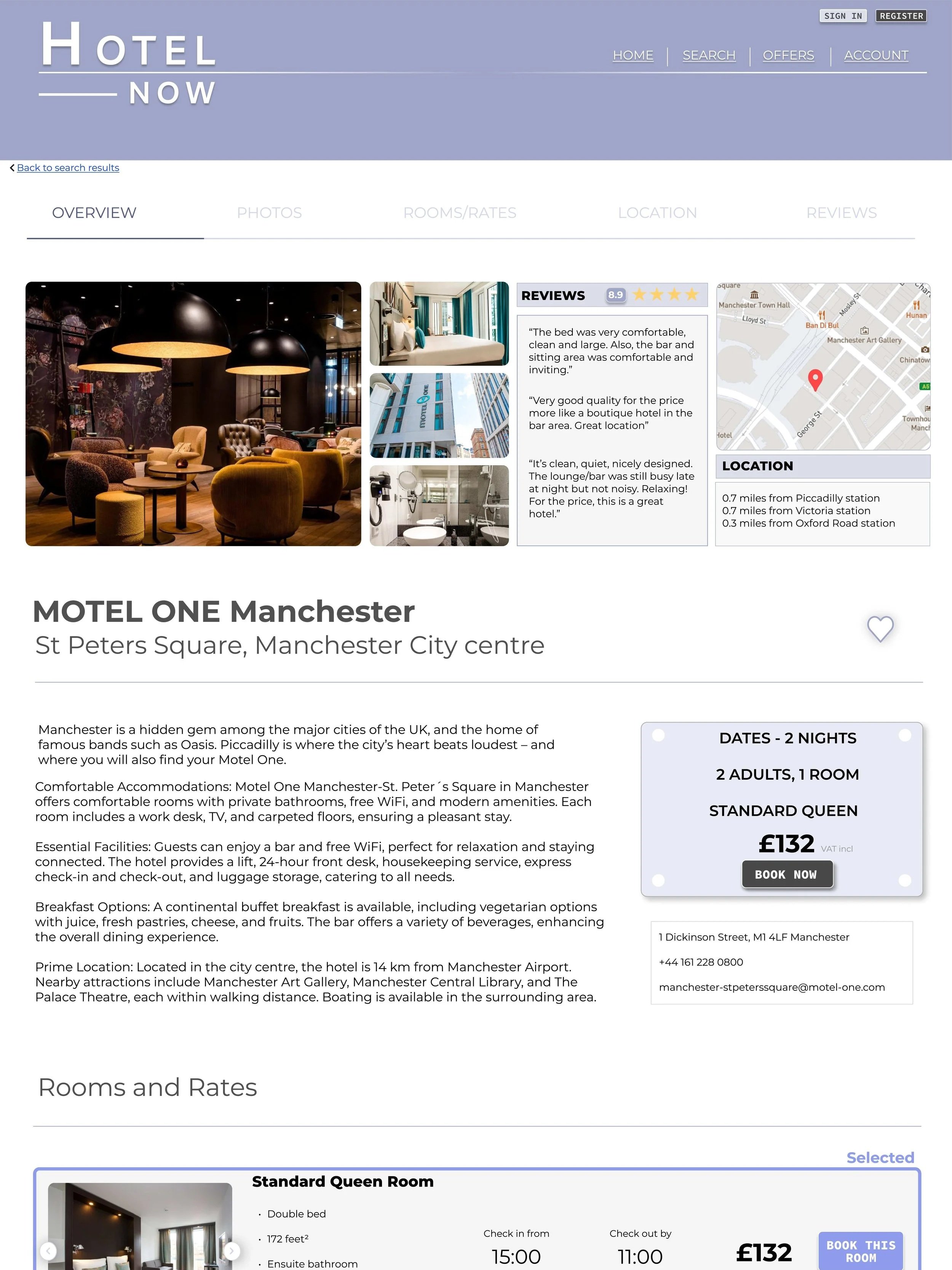
I created the medium-high fidelity prototype using Figma. Using the wireframe sketches as the starting point, the design continued to develop as more detail was added. Reflecting on what I had learnt about what users want, I made sure I followed design conventions and patterns for hotel sites as well as adding any improvements that they would need.
I knew what screens to design here and how different actions would the user to the next screen from the analysing stage.
Prototype